


SHEILAS
IDENTIDADE VISUAL
EN
The former Sheila Guerra Esmalteria recently embarked on a rebranding journey to reflect its new essence: more dynamic, stronger and more innovative. In this process, we not only renewed its image, but also had the opportunity to modernize and develop a name that perfectly embodies the spirit of the brand. "Sheilas", an Australian expression that means "They", was chosen to represent and put the spotlight on them: women, who find in Sheilas a place to renew their self-esteem. When developing this new identity, we sought a striking visual, with a visual narrative that conveys female protagonism, dynamism and creativity, elements that are intrinsic to the brand. To achieve this, we immersed ourselves in an approach that incorporates unique and memorable visual elements.
PT
A antiga Sheila Guerra Esmalteria, recentemente embarcou em uma jornada de rebranding para refletir sua nova essência: mais dinâmica, mais forte e inovadora. Nesse processo, não apenas renovamos sua imagem, mas também tivemos a oportunidade de modernizar e desenvolver o nome que incorpora perfeitamente o espírito da marca.
"Sheilas", uma expressão Australiana que significa “Elas”, foi escolhido para representar e colocar em foco elas: mulheres, que encontram na Sheilas um lugar para renovar sua autoestima. Ao desenvolver essa nova identidade, buscamos um visual marcante, com uma narrativa visual que transmite protagonismo feminino, dinamismo
e criatividade, elementos que são intrínsecos a marca. Para isso, mergulhamos em uma abordagem que incorpora elementos visuais únicos e memoráveis.


EN
Colors play a fundamental role in the new brand identity. We have chosen vibrant and distinct tones that not only capture attention but also evoke protagonism and a sense of energy and vitality. Each color was carefully selected to complement the other, creating a harmonious palette that reflects the diversity of our target audience.
PT
As cores desempenham um papel fundamental na nova identidade da marca. Optamos por tons vivos e distintos,
que não apenas capturam a atenção, mas também evocam protagonismo e uma sensação de energia e vitalidade.
Cada cor foi cuidadosamente selecionada para complementar a outra, criando uma paleta harmoniosa que reflete
a diversidade do seu público-alvo.


EN
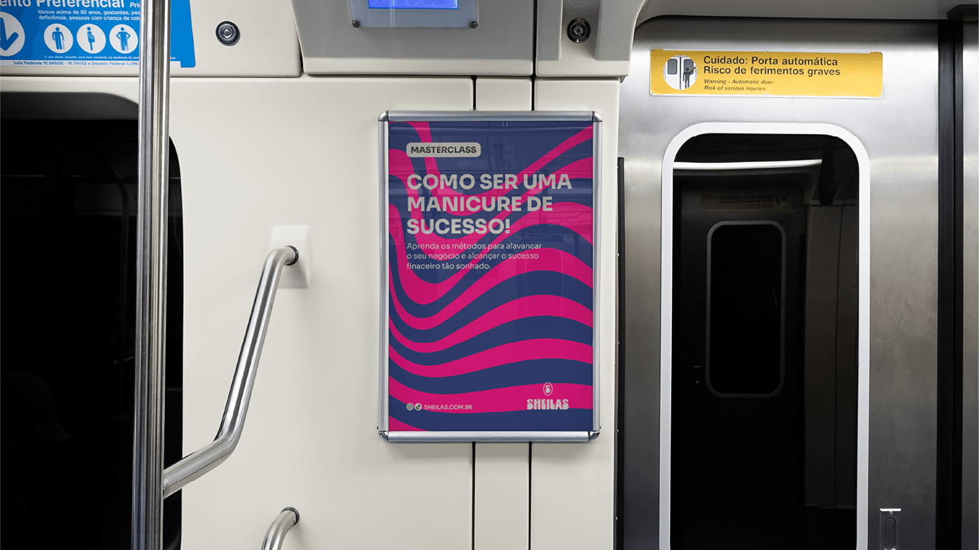
The typography was designed to convey movement, as if it were the stroke of a paintbrush loaded with ink. This choice not only adds a sense of liveliness to the brand, but also establishes a connection with artistic expression, highlighting the creative nature of Sheilas. 6 signatures were developed with the aim of expanding the application of the logo and making it more flexible for different contexts.
PT
A tipografia foi projetada para transmitir movimento, como se fosse o traço de um pincel carregado de tinta.
Essa escolha não apenas adiciona uma sensação de vivacidade à marca, mas também estabelece uma conexão
com a expressão artística, destacando a natureza criativa da Sheilas. Foram desenvolvidas 6 assinaturas com
o objetivo de ampliar a aplicação do logotipo e torná-lo mais flexível para diversos contextos.


EN
Visual elements were incorporated to portray the movement and artistic expression of the manicure.
Organic and fluid shapes were chosen to convey the idea of constantly evolving creativity. Continuous
lines were added to reinforce the feeling of dynamism and freedom of expression, making the brand
truly unique and unmistakable.
lines were added to reinforce the feeling of dynamism and freedom of expression, making the brand
truly unique and unmistakable.
PT
Os elementos visuais foram incorporados para retratar o movimento e a expressão artística da manicure.
Formas orgânicas e fluidas foram escolhidas para transmitir a ideia de criatividade em constante evolução.
Foram adicionadas linhas contínuas para reforçar a sensação de dinamismo e liberdade expressiva, tornando
a marca verdadeiramente única e inconfundível.


EN
The final result is a visual identity that redefines the brand's positioning, innovating in name, color and shapes exploring developments that go beyond the services provided until then and establishing a new standard of excellence in the market. Through rebranding, the brand reinvents itself, staying true to its heritage while embracing the future with enthusiasm and creativity.
Sheilas is not just a brand, it is a women's movement that overflows with energy and innovation.
PTO resultado final é uma identidade visual que redefine o posicionamento da marca, inovando em nome, cor e formas explorando desdobramentos que vão além dos serviços até então prestados e estabelecendo um novo padrão
de excelência no mercado. Através do rebranding, a marca se reinventa, mantendo-se fiel à sua herança enquanto abraça o futuro com entusiasmo e criatividade.
Sheilas não é apenas uma marca, é um movimento de mulheres que transborda energia e inovação.


